It has been a longstanding goal of mine to gain confidence in public speaking, give a technical talk at a conference and develop R packages. I’ve noticed a trend (and a quality I’d like to inherit) amongst other productive R programmers which was a greater ability to communicate results through sharing methodologies and best practices, so I’ve been signing up to speak on projects, packages and development paradigms in the R and data science community.
After accomplishing one of my goals, the first two seemed to be achievable in tandem as I sought out opportunities to share my work with others while learning how to communicate technical topics in a receptive way. I have not always been a confident public speaker and had little exposure in presenting from poster sessions, so in 2017 I signed up (and was asked!) to give talks at three different venues:
-
RhodyRstats user group and Coastal Institute at the University of Rhode Island invited me to kickoff their Careers in R seminar about my transition from Biomedical Engineering to Data Science with R.
-
Portland user group on ‘Extending Shiny by Enhancing User Experience with shinyLP’ in Oregon
-
Open Data Science Conference, East on ‘Open Government Data & Beer Analytics’ in Boston, MA
In turning my weekend data science adventures into blog posts, I hypothesized if my talks at meetup group, events and conferences would have an impact on my CRAN package downloads and sought out to explore those metrics using the cranlogs package.
There were already some interesting shiny applications that utilized cranlogs to get CRAN metrics: cran-downloads, and shiny-crandash using flexdashboard, but I wanted to overlay CRAN download metrics for my packages (ttbbeer and shinyLP) with the dates of my speaking engagements to see if there was any trends leading up and/or after the talks. Here is the story through visualization of the impact of speaking engagements on my CRAN package downloads:
# Query download counts directly from R with the cranlogs R package.
library(devtools)
library(ggplot2)
library(magrittr)
#install_git("git://github.com/metacran/cranlogs.git")
library(cranlogs)
library(dplyr)
library(plotly)
library(ggrepel)
library(emo)
## Calculate a starting download date
today_ish = Sys.Date() - 1
today = Sys.Date()
# Download CRAN metrics
c <- cran_downloads(from = "2016-07-03", to = today, packages = c("shinyLP", "ttbbeer"))
## Important days for events and speaking
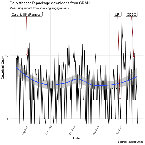
cardiff_talk = as.Date("2016-08-02") # i gave a remote talk
uri_talk = as.Date("2017-03-30")
pdx_talk = as.Date("2017-04-06")
odsc_talk = as.Date("2017-05-05")
c$important_days <- NA
c$important_days[which(c$date == cardiff_talk & c$package == 'ttbbeer')] <- "Cardiff, UK (Remote)"
c$important_days[which(c$date == uri_talk)] <- "URI"
c$important_days[which(c$date == pdx_talk & c$package == 'shinyLP')] <- "PDX"
c$important_days[which(c$date == odsc_talk & c$package == 'ttbbeer')] <- "ODSC"
c$important_days[which(c$date == as.Date("2016-11-27") & c$package == 'shinyLP')] <- "Second release to CRAN" # abnormal spike in downloads
# Transform and visualize data
c %>% slice(73:nrow(c)) %>% # shinyLP was not available until 9/13/17
    filter(package == 'ttbbeer') %>%
    ggplot(., aes(x = date, y = count, label = important_days)) +
        #geom_point() +
        geom_line() +
        geom_smooth() +
        scale_y_log10() +
        geom_label_repel(na.rm = T, nudge_y = 10, nudge_x = -6,  segment.color = "darkred",
                         arrow = arrow(type = "closed",length = unit(0.1, "inches"))) +
        theme_minimal() +
        theme(legend.position="none", axis.text.x=element_text(angle=60, hjust=1) ) +
        labs(title = "Daily ttbbeer R package downloads from CRAN",
             subtitle = "Measuring impact from speaking engagements",
             x = "Date",
             y = "Download Count",
             caption = "Source: @jasdumas") +
        scale_x_date(date_breaks = "2 month", date_labels =  "%b %Y")
c %>% slice(73:nrow(c)) %>% # shinyLP was not available until 9/13/17
    filter(package == 'shinyLP') %>%
    ggplot(., aes(x = date, y = count, label = important_days)) +
        #geom_point() +
        geom_line() +
        geom_smooth() +
        scale_y_log10() +
        geom_label_repel(na.rm = T,  nudge_x = -20,  segment.color = "darkred",
                         arrow = arrow(type = "closed",length = unit(0.1, "inches"))) +
        theme_minimal() +
        theme(legend.position="none",  axis.text.x=element_text(angle=60, hjust=1)) +
        labs(title = "Daily shinyLP R package downloads from CRAN",
             subtitle = "Measuring impact from speaking engagements",
             x = "Date",
             y = "Download Count",
             caption = "Source: @jasdumas") +
        scale_x_date(date_breaks = "2 month", date_labels =  "%b %Y")
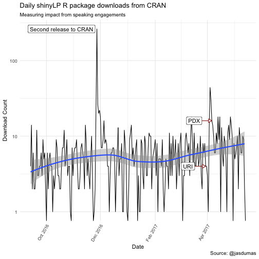
There are some interesting trends in downloads following my invited talk at Coastal Institute (URI), which kicked of 2 additional talks within a nearly 5 week span and a spike in shinyLP downloads the day after the second release to CRAN 🎉.
Causal Impact of my first, in-person talk at the Coastal Institute (URI)
For further analysis I will use the CausalImpact from Google to answer the question of estimating the causal effect of giving talks on my CRAN package downloads, by time period before and after my first talk at URI. This approach in determining impact is to try and predict the counter factual, i.e., how would package downloads would have evolved after the intervention (after giving the talk) if the intervention had never occurred. Some gotchas to this approach is that the post period could have been amplified by additional speaking engagements and therefore the singe event determination could not be the true event for measuring causal impact and the pre period contains some lead-up times for events that were annouced on Twitter prior to the initial events
library(CausalImpact)
# run this one just for ttbbeer
df_ttbbeer <-  c %>% filter(package == 'ttbbeer')

df_ttbbeer <- df_ttbbeer[, c(1, 2)]

pre_period = c(df_ttbbeer$date[1], df_ttbbeer$date[which(df_ttbbeer$date == uri_talk)])

post_period = c(df_ttbbeer$date[which(df_ttbbeer$date == uri_talk)]+1, tail(df_ttbbeer$date)[6])

impact <- CausalImpact(df_ttbbeer, pre_period, post_period)

plot(impact)
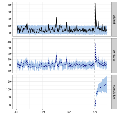
summary(impact, "report")
## Analysis report {CausalImpact}
##
##
## During the post-intervention period, the response variable had an average value of approx. 6.64. By contrast, in the absence of an intervention, we would have expected an average response of 3.88. The 95% interval of this counterfactual prediction is [2.69, 5.13]. Subtracting this prediction from the observed response yields an estimate of the causal effect the intervention had on the response variable. This effect is 2.77 with a 95% interval of [1.51, 3.96]. For a discussion of the significance of this effect, see below.
##
## Summing up the individual data points during the post-intervention period (which can only sometimes be meaningfully interpreted), the response variable had an overall value of 299.00. By contrast, had the intervention not taken place, we would have expected a sum of 174.50. The 95% interval of this prediction is [120.87, 231.05].
##
## The above results are given in terms of absolute numbers. In relative terms, the response variable showed an increase of +71%. The 95% interval of this percentage is [+39%, +102%].
##
## This means that the positive effect observed during the intervention period is statistically significant and unlikely to be due to random fluctuations. It should be noted, however, that the question of whether this increase also bears substantive significance can only be answered by comparing the absolute effect (2.77) to the original goal of the underlying intervention.
##
## The probability of obtaining this effect by chance is very small (Bayesian one-sided tail-area probability p = 0.001). This means the causal effect can be considered statistically significant.
# run this one just for shinyLP
df_shinylp <-  c %>% filter(package == 'shinyLP')

df_shinylp <- df_shinylp[, c(1, 2)]

pre_period2 = c(df_shinylp$date[1], df_shinylp$date[which(df_shinylp$date == uri_talk)])

post_period2 = c(df_shinylp$date[which(df_shinylp$date == uri_talk)]+1, tail(df_shinylp$date)[6])

impact2 <- CausalImpact(df_shinylp, pre_period2, post_period2)

plot(impact2)
summary(impact2, "report")
## Analysis report {CausalImpact}
##
##
## During the post-intervention period, the response variable had an average value of approx. 9.51. In the absence of an intervention, we would have expected an average response of 6.18. The 95% interval of this counterfactual prediction is [0.26, 11.72]. Subtracting this prediction from the observed response yields an estimate of the causal effect the intervention had on the response variable. This effect is 3.33 with a 95% interval of [-2.20, 9.25]. For a discussion of the significance of this effect, see below.
##
## Summing up the individual data points during the post-intervention period (which can only sometimes be meaningfully interpreted), the response variable had an overall value of 428.00. Had the intervention not taken place, we would have expected a sum of 278.15. The 95% interval of this prediction is [11.86, 527.19].
##
## The above results are given in terms of absolute numbers. In relative terms, the response variable showed an increase of +54%. The 95% interval of this percentage is [-36%, +150%].
##
## This means that, although the intervention appears to have caused a positive effect, this effect is not statistically significant when considering the entire post-intervention period as a whole. Individual days or shorter stretches within the intervention period may of course still have had a significant effect, as indicated whenever the lower limit of the impact time series (lower plot) was above zero. The apparent effect could be the result of random fluctuations that are unrelated to the intervention. This is often the case when the intervention period is very long and includes much of the time when the effect has already worn off. It can also be the case when the intervention period is too short to distinguish the signal from the noise. Finally, failing to find a significant effect can happen when there are not enough control variables or when these variables do not correlate well with the response variable during the learning period.
##
## The probability of obtaining this effect by chance is p = 0.132. This means the effect may be spurious and would generally not be considered statistically significant.
The reports from these analysis are quite interesting and aid in supporting my thoughts around package downloads being impacted (ttbbeer to a significant level) by beginning to give talks. I also spoke about ttbbeer exclusively at a larger conference which could lead to inflated downloads during the post period
Forecasting Future CRAN downloads:
I have been wanting to explore the Prophet package from Facebook since it launched, and I added this additional section which follows along the documentation for R to get some predictions about future downloads for my CRAN packages. Some gotchas with this appraoch is the need to round the predictions up, as the count is discrete
library(prophet)
c$y <- c$count
c$ds <- c$date
m_ttbbeer <- c %>% filter(package == 'ttbbeer')

m_ttbbeer <- m_ttbbeer[, c(5, 6)]

m_shinylp <- c %>% filter(package == 'shinyLP')

m_shinylp <- m_shinylp[, c(5, 6)]
Fit the models for both packages seperately:
m_ttbbeer_fit <- prophet(m_ttbbeer)
## Initial log joint probability = -4.02776
## Optimization terminated normally:
##   Convergence detected: relative gradient magnitude is below tolerance
m_shinylp_fit <- prophet(m_shinylp)
## Initial log joint probability = -2.62488
## Optimization terminated normally:
##   Convergence detected: relative gradient magnitude is below tolerance
Create dataframes of future datestamps for predictions to be made:
future_ttbbeer <- make_future_dataframe(m_ttbbeer_fit, periods = 90) # 90 days out
future_shinylp <- make_future_dataframe(m_shinylp_fit, periods = 90)
Use the generic predict function:
forecast_ttbbeer <- predict(m_ttbbeer_fit, future_ttbbeer)
tail(forecast_ttbbeer[c('ds', 'yhat', 'yhat_lower', 'yhat_upper')])
##             ds     yhat yhat_lower yhat_upper
## 401 2017-08-07 5.685472  0.6864452  10.967567
## 402 2017-08-08 6.578210  1.5521184  11.791462
## 403 2017-08-09 6.248853  1.2338648  11.254427
## 404 2017-08-10 5.786098  0.8473032  10.862714
## 405 2017-08-11 5.567692  0.7022517  10.155702
## 406 2017-08-12 3.905032 -1.1035745   8.690154
forecast_shinylp <- predict(m_shinylp_fit, future_shinylp)
tail(forecast_shinylp[c('ds', 'yhat', 'yhat_lower', 'yhat_upper')])
##             ds     yhat yhat_lower yhat_upper
## 401 2017-08-07 7.164134  -12.14148   26.22302
## 402 2017-08-08 8.376941  -10.00281   28.13020
## 403 2017-08-09 8.301135  -11.10511   28.03236
## 404 2017-08-10 7.581017  -11.68299   26.20226
## 405 2017-08-11 7.172581  -11.95713   25.27349
## 406 2017-08-12 5.431217  -14.40536   24.19389
Plot the forecast and seperate componets:
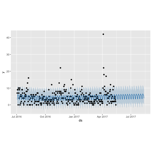
plot(m_ttbbeer_fit, forecast_ttbbeer)
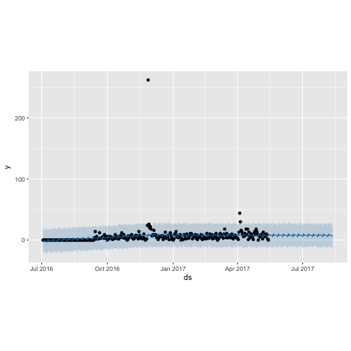
plot(m_shinylp_fit, forecast_shinylp)
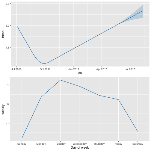
prophet_plot_components(m_ttbbeer_fit, forecast_ttbbeer)
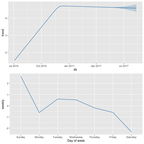
prophet_plot_components(m_shinylp_fit, forecast_shinylp)
Last year, after attending the annual R conference in Stanford, CA I began to aggregating all of my loose functions and code into R packages to submit to CRAN. I’ve spent the last year developing two packages: one for beer statistics, called ttbbeer and another for creating landing pages for shiny applications, called shinyLP thereby transitioning from an R user to an R package developer. shinyGEO is an entirely separate adventure that has been ongoing since Summer 2014, and which will hopefully conclude soon as a package submitted to rOpenSci for review.